Stylesheet Management
Introduction
Stylesheet Management allows you to modify the appearance of your graph results based on the label of the element (vertex, edge). Each element label found on your graph database will automatically be assigned a default stylesheet that will differentiate it from other elements. This is also applicable when new elements are introduced to the graph as the data model for your database is automatically updated. For reference, see Data Model Management. To modify an element's stylesheet, you can find the element from the Connection List sidebar by drilling into the Data Model and clicking on  for the element. Alternatively from the Data Model Explorer, when focusing on an element, you will be given an option to edit the element's stylesheet. Changes to an element's stylesheet are automatically applied to any opened graph results visualization.
Edge Stylesheet Options
When editing an Edge's Stylesheet, you will be presented with the following screen:
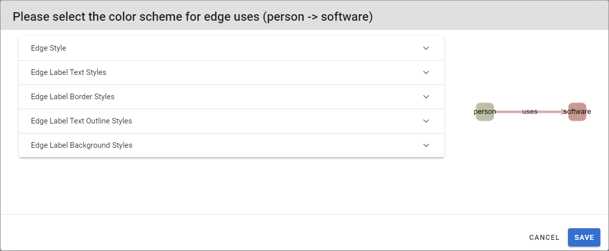
The following options are available:
- Edge Line Style:
- Target Arrow Shape: The shape of the edge’s target arrow
- Source Arrow Shape:The shape of the edge’s source arrow
- Target Arrow Color: The colour of the edge’s target arrow
- Source Arrow Color: The colour of the edge’s source arrow
- Line Color:The colour of the edge’s line
- Line Style:The style of the edge’s line; may be solid, dotted, or dashed
- Line Width: The width of an edge’s line
- Edge Label Text Styles:
- Label Text Value: The text as derived from the edge's properties to be displayed on the graph
- Label Text Color: The colour of the element’s label
- Label Text Transformation: A transformation to apply to the label text; may be none, uppercase, or lowercase
- Label Font Size: The size of the label text
- Edge Label Border Styles:
- Text Border Width: The width of the border around the label
- Text Border Style: The style of the border around the label; may be solid, dotted, dashed, or double
- Text Border Opacity: The width of the border around the label; the border is disabled for 0 (default value)
- Label Text Border Color: The colour of the border around the label
- Edge Label Text Outline Styles:
- Text Outline Width: The size of the outline on label text
- Text Outline Opacity: The opacity of the outline on label text
- Label Text Outline Color: The colour of the outline around the element’s label text
- Edge Label Background Styles:
- Label Background Shape: The shape to use for the label background, can be rectangle or round-rectangle
- Label Background Color: A colour to apply on the text background
- Text Background Opacity: The opacity of the label background; the background is disabled for 0 (default value)
Vertex Stylesheet Options
When editing a Vertex's Stylesheet, you will be presented with the following screen:
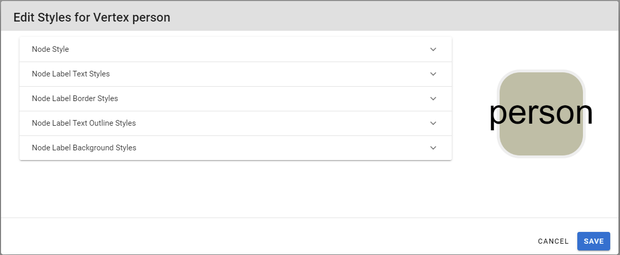
The following options are available:
- Node Style:
- Node Shape: The shape of the node’s body
- Node Background Color: The colour of the node’s body
- Node Background Image: Allows specifying a background image for the node's body
- Node Background Color Opacity: Allows specifying the opacity of the node's background color. It is recommended to set to 0 if Node Background Image is also specified unless you would like the background color and image to be used in conjunction.
- Node Border Color: The colour of the node’s border
- Node Border Style: The style of the node’s border; may be solid, dotted, dashed, or double
- Node Border Width: The size of the node’s border
- Node Label Text Styles:
- Label Text Value: The text as derived from the node's properties to be displayed on the graph
- Label Text Color: The colour of the element’s label
- Label Text Transformation: A transformation to apply to the label text; may be none, uppercase, or lowercase
- Label Font Size: The size of the label text
- Node Label Border Styles:
- Text Border Width: The width of the border around the label
- Text Border Style: The style of the border around the label; may be solid, dotted, dashed, or double
- Text Border Opacity: The width of the border around the label; the border is disabled for 0 (default value)
- Label Text Border Color: The colour of the border around the label
- Node Label Text Outline Styles:
- Text Outline Width: The size of the outline on label text
- Text Outline Opacity: The opacity of the outline on label text
- Label Text Outline Color: The colour of the outline around the element’s label text
- Node Label Background Styles:
- Label Vertical Alignment:The vertical alignment of a node’s label; may have value top, center, or bottom
- Label Horizontal Alignment: The vertical alignment of a node’s label; may have value left, center, or right
- Label Background Shape: The shape to use for the label background, can be rectangle or round-rectangle
- Label Background Color: A colour to apply on the text background
- Text Background Opacity: The opacity of the label background; the background is disabled for 0 (default value)